
Portebleue

coffee packaging
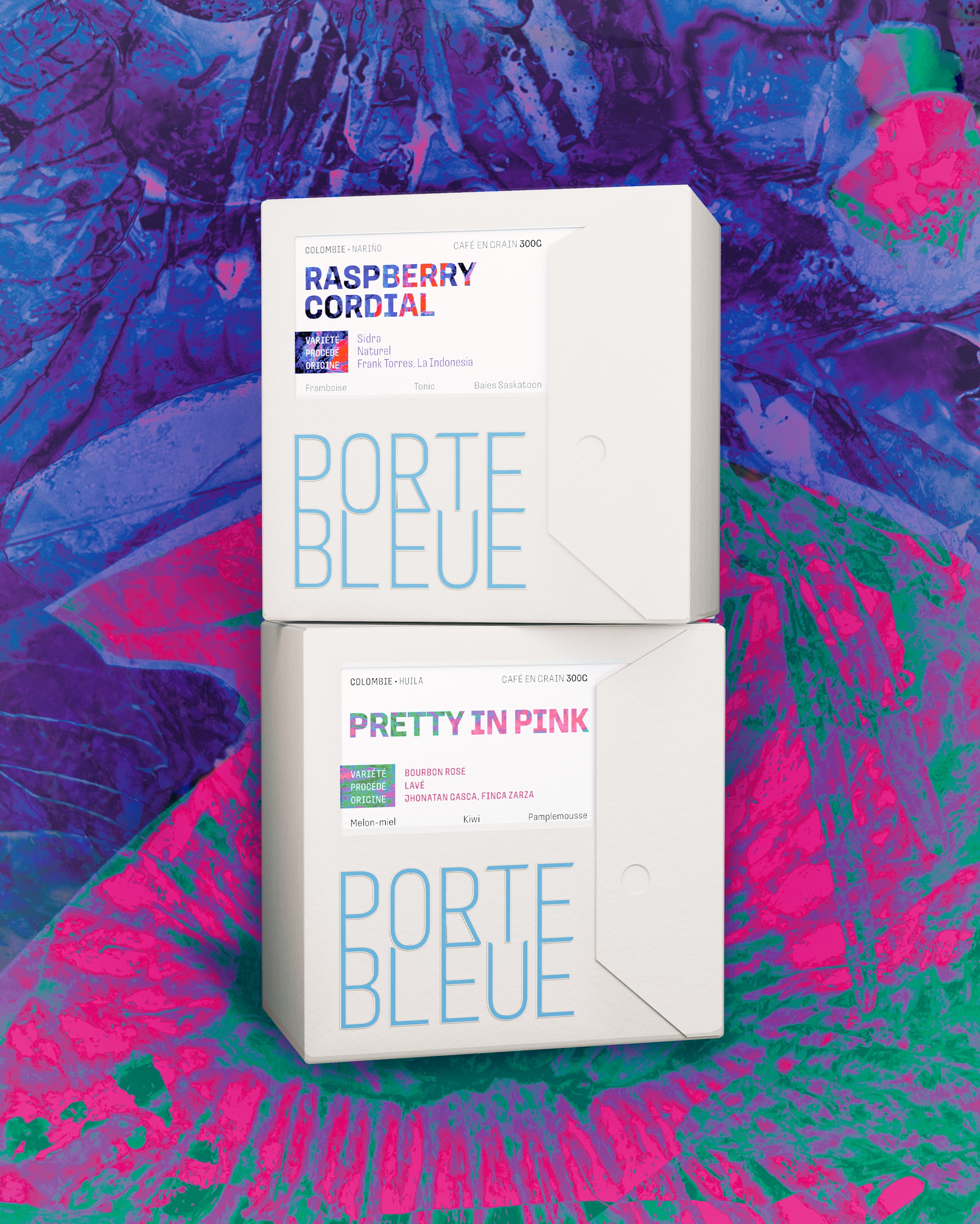
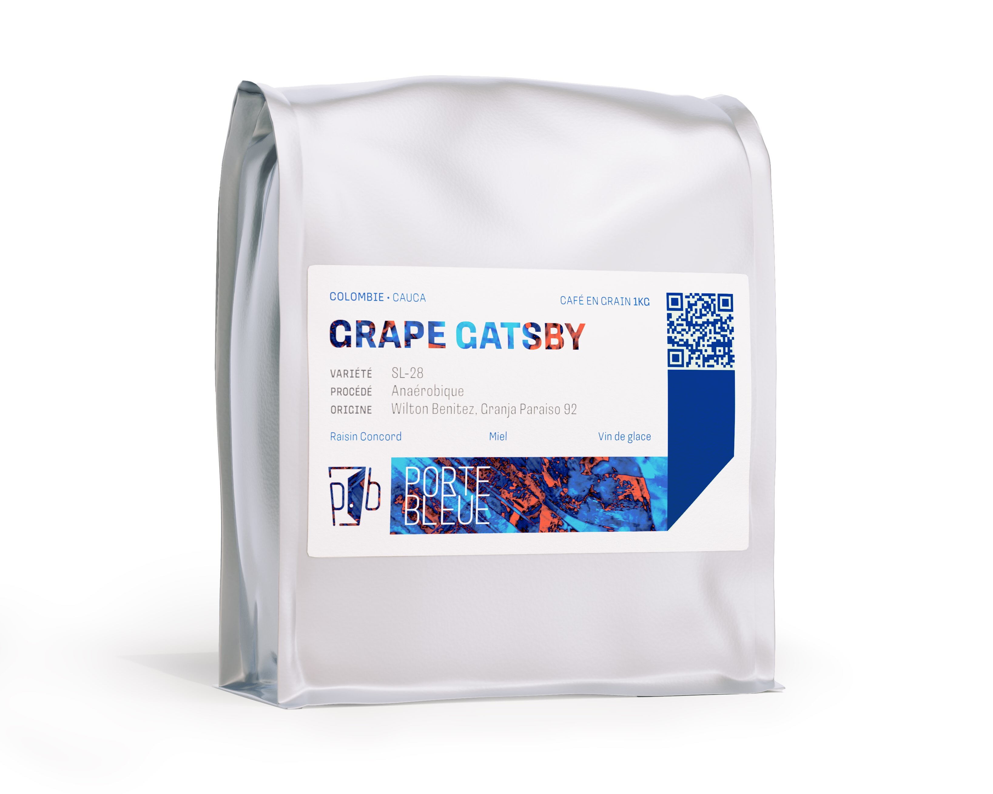
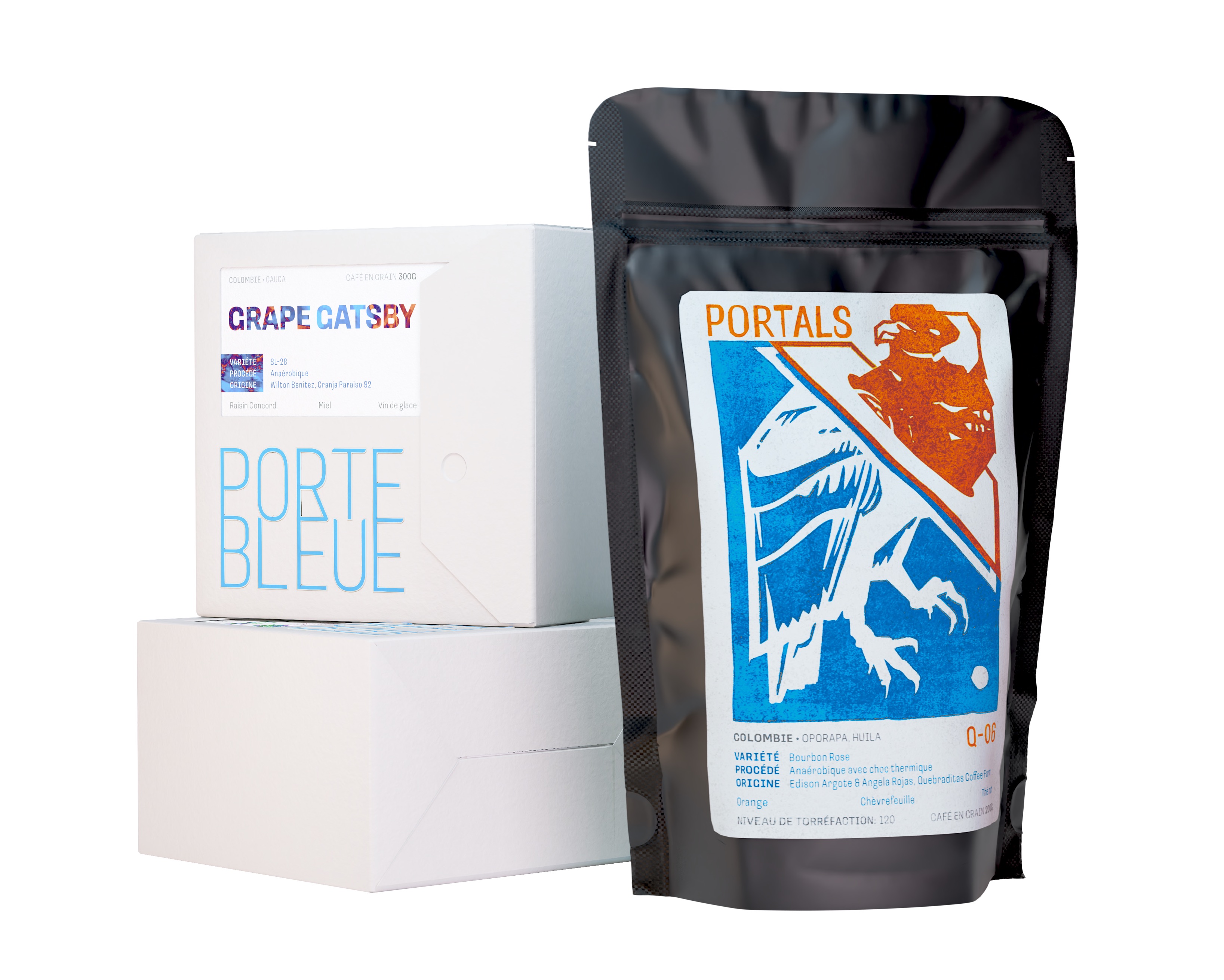
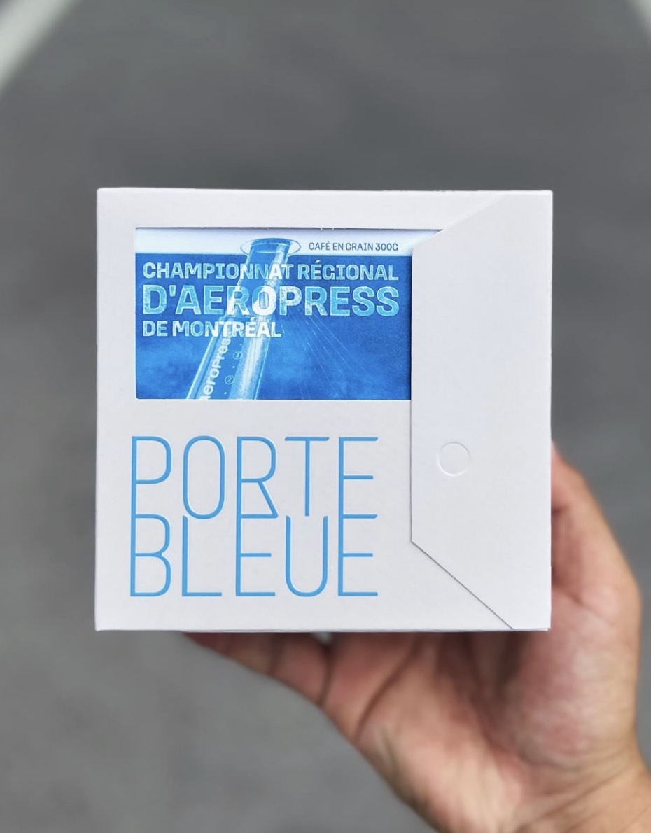
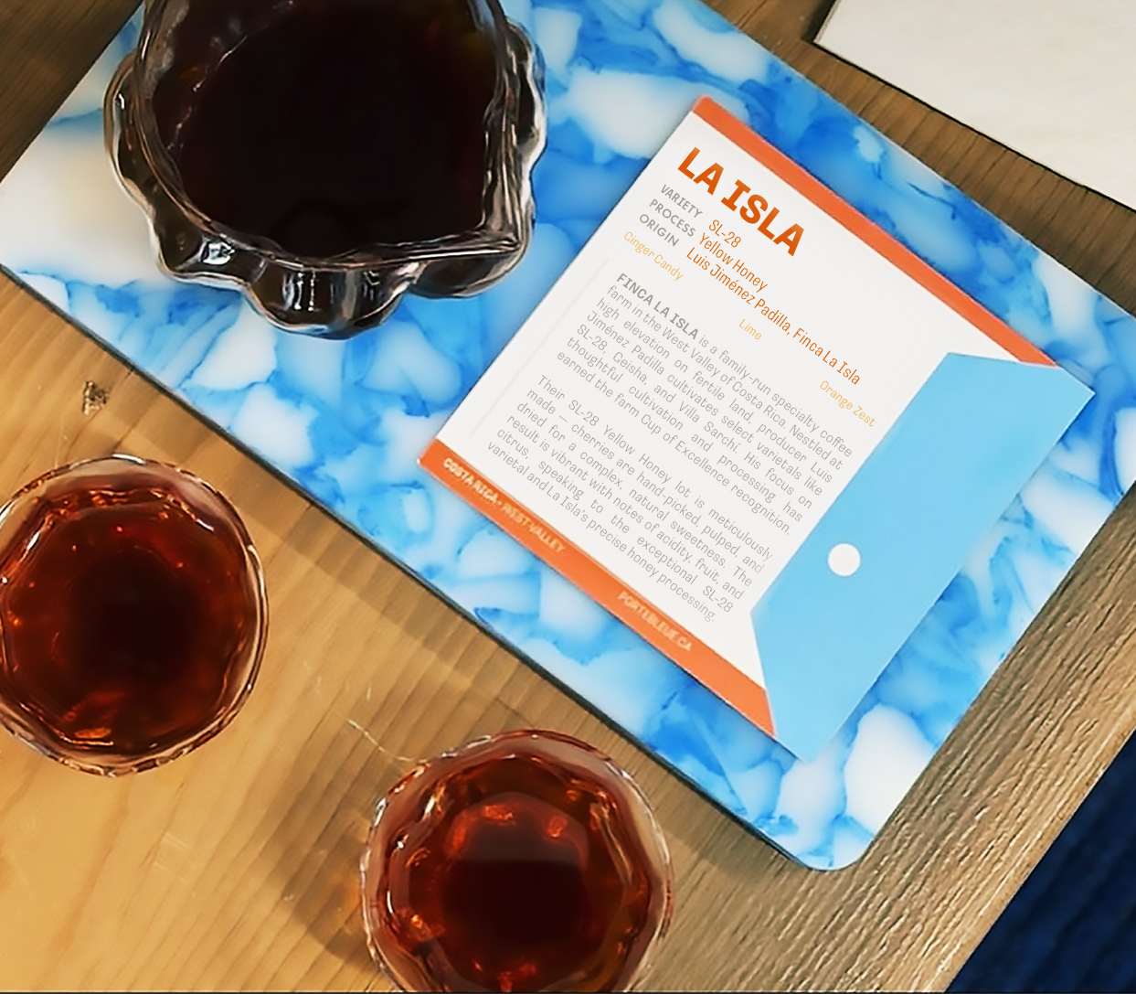
A redesign of their bean bags, this sleek boxed design brought Portebleue Coffee into the modern era of the Montréal third-wave coffee scene. The new bold packaging stands out among the crowd for an elevated experience. Watch the Packaging Overview for more information about our design choices.




Portals Coffee
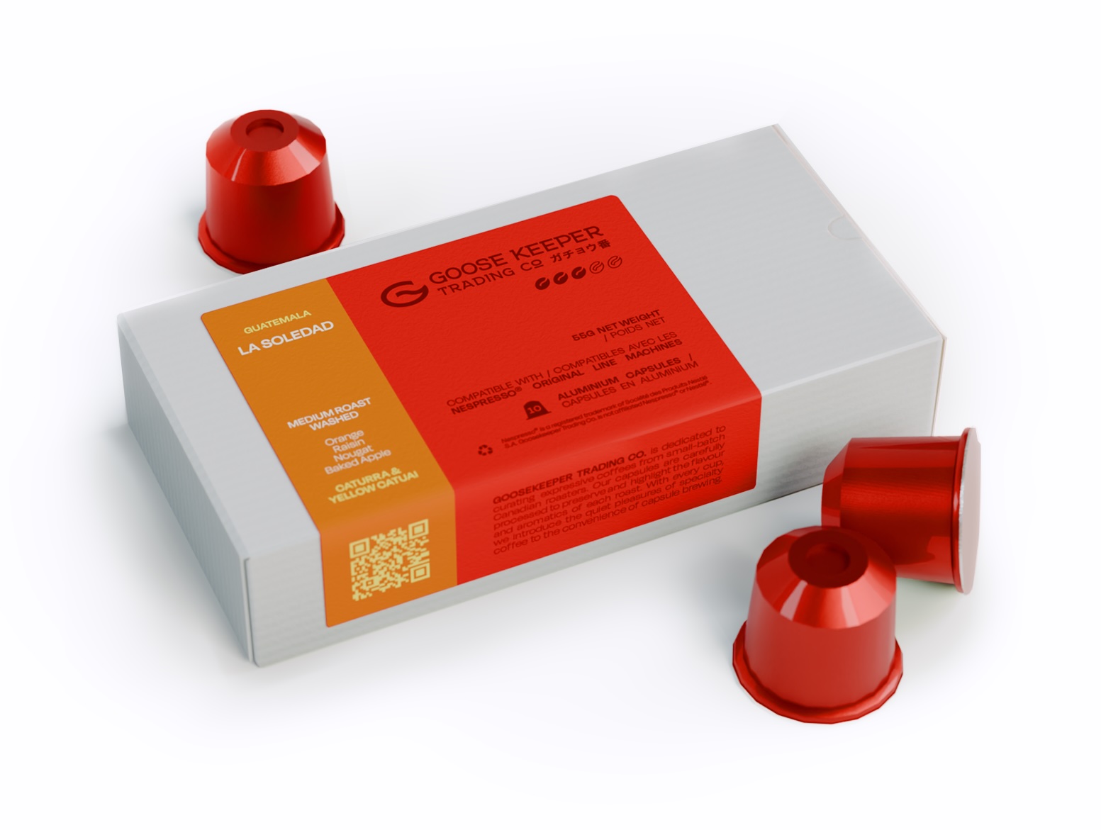
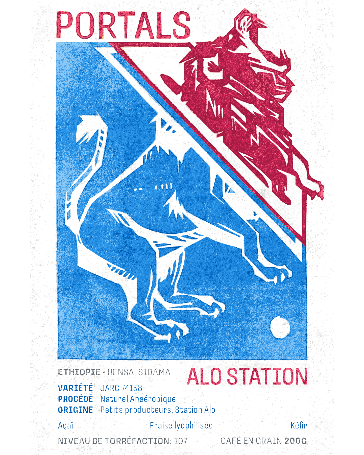
Expanding on their coffee selection, Portebleue launched their first-ever monthly subscription, Portals Coffee. These designs are fun and vibrant to match the unique profiles of these extra-exclusive, limited-run coffees. Each illustration displays the country of origin's national animal.
Aeropress Regional Championships
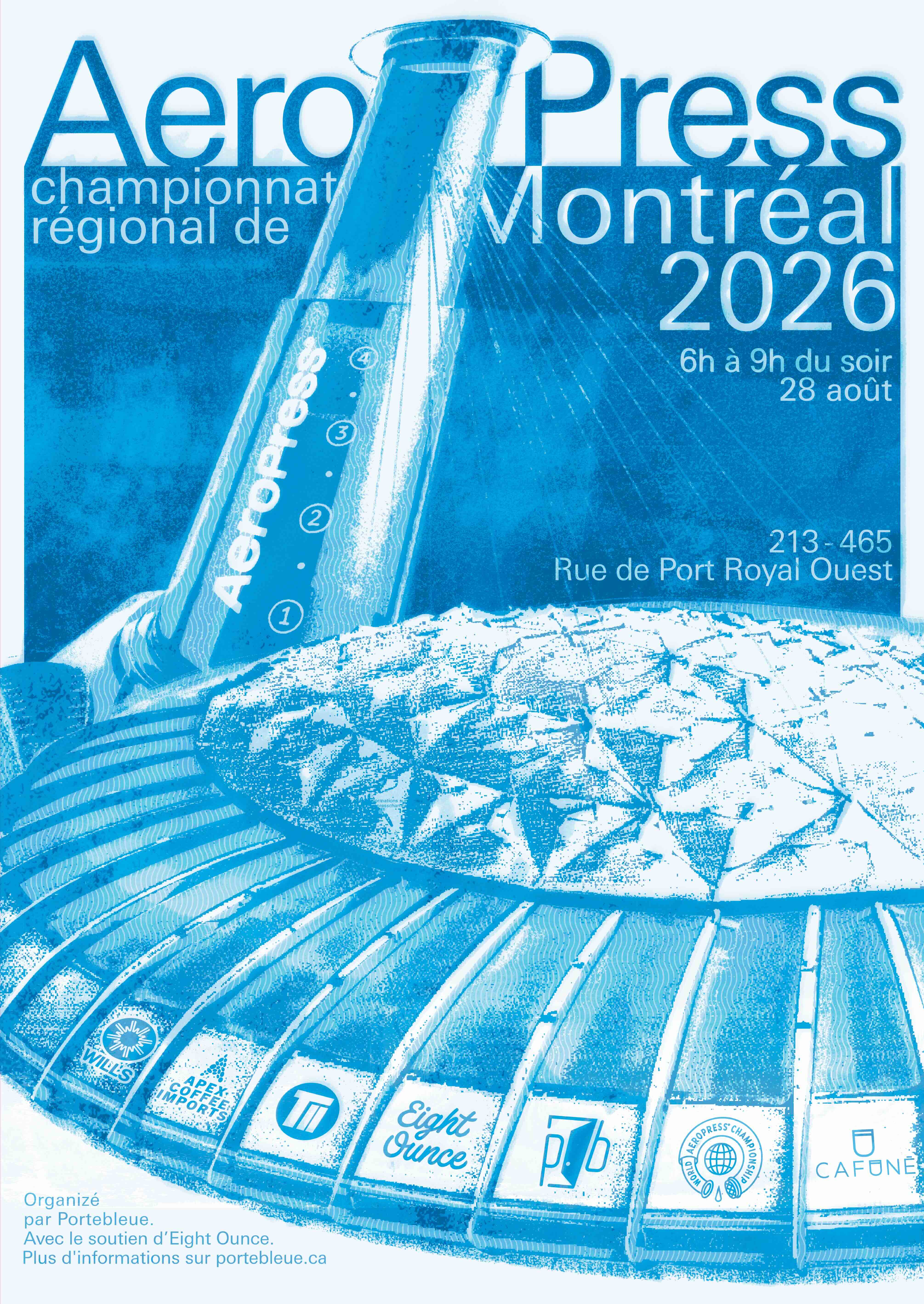
As the host of the 2026 Montréal Aeropress Regional Championships, Portebleue needed to deliver a creative poster that represented Montréal's history and culture. This design pairs the Aeropress coffee maker with the iconic 1976 Montréal Olympic Stadium, in a style reminiscent of the screen printed posters of its time.

rebrand &
marketing
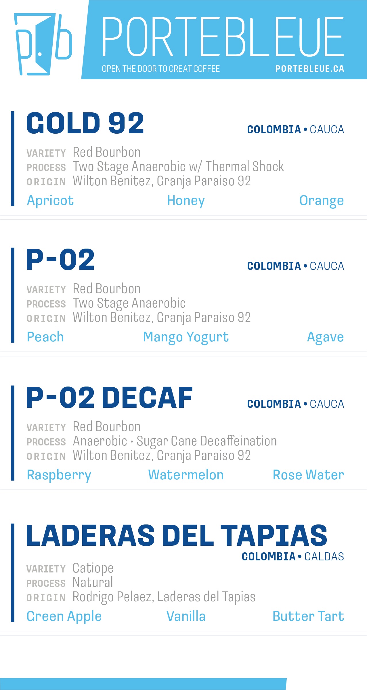
Alongside the new packaging, we performed a full brand overhaul. We cleaned up and modernized their old logo, adding to their toolkit new brand colours, ephemera, and marketing materials.

web design
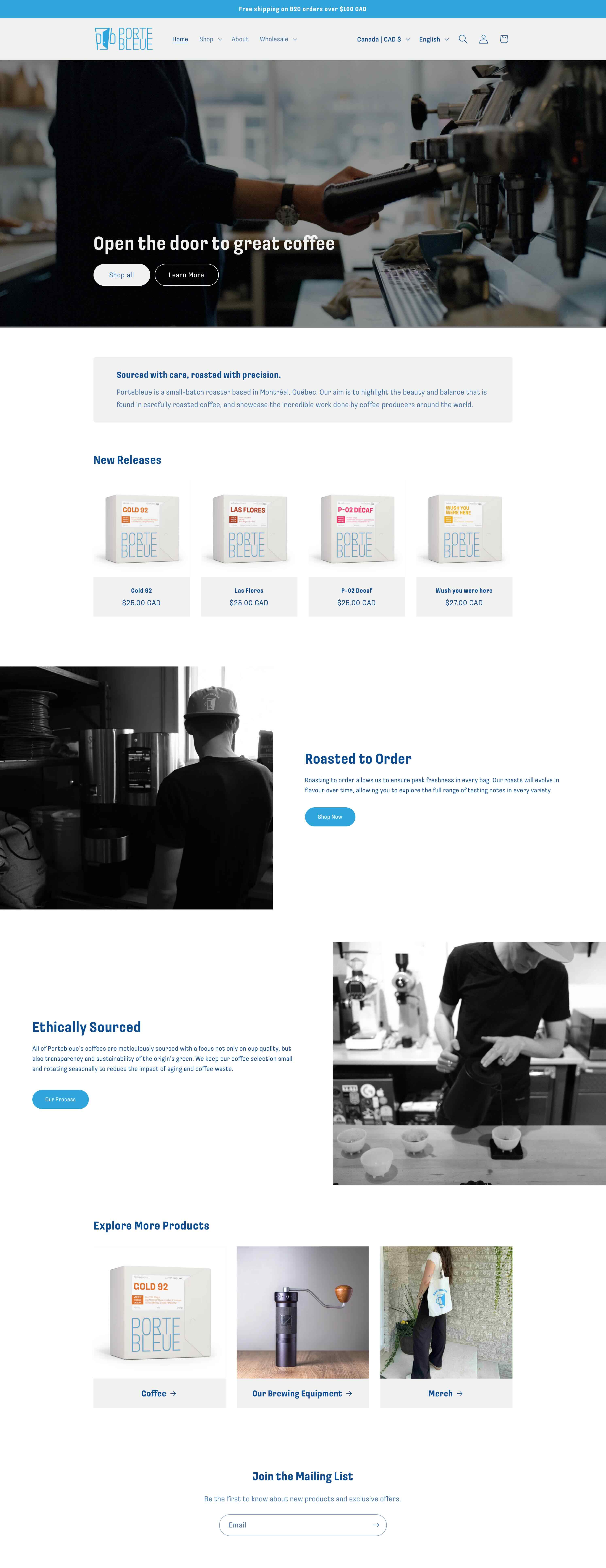
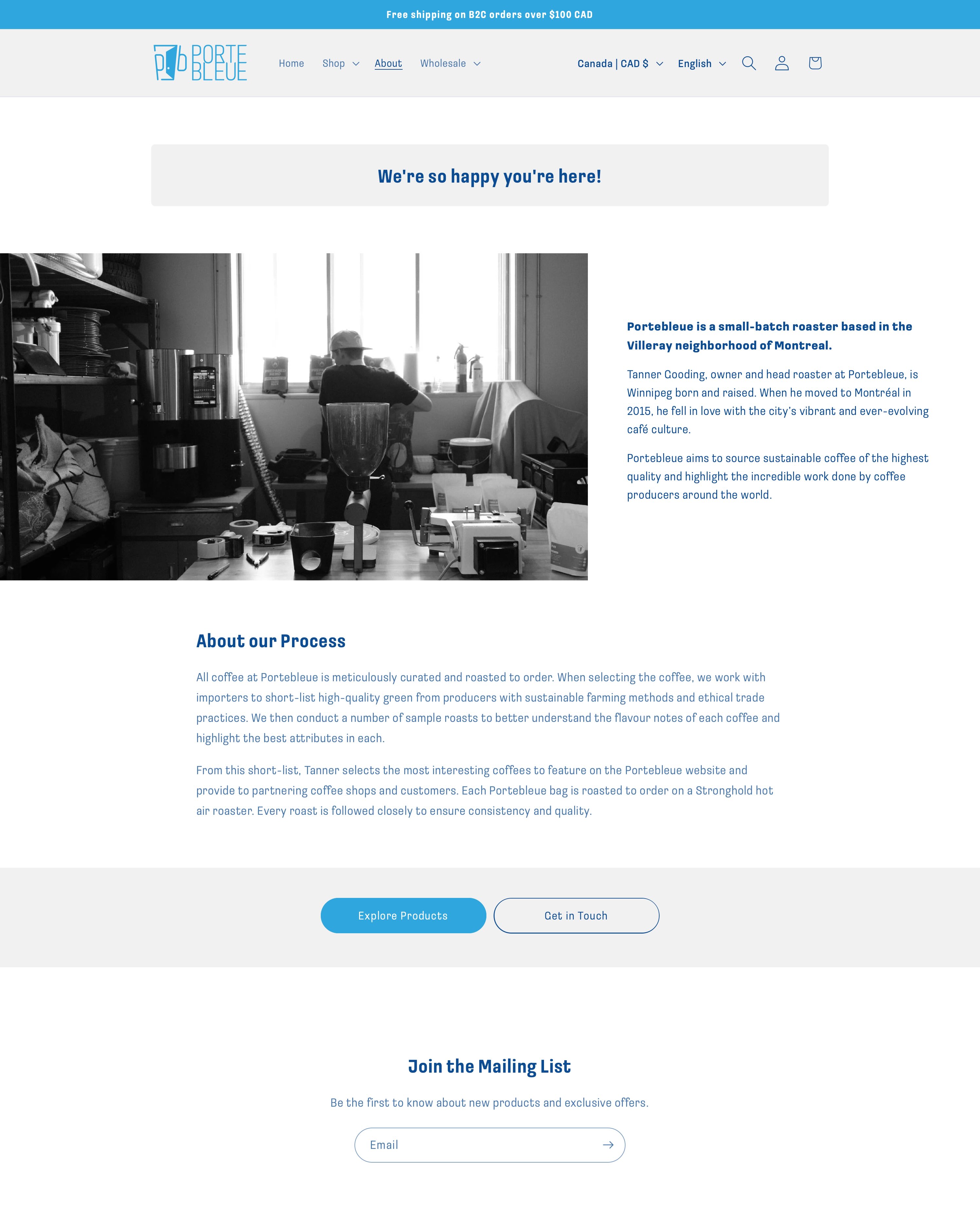
To reflect the new direction, we redesigned Portebleue's website. Our goal was to welcome new customers with a warmer landing page, clearer formatting on product features, and a narrative that emphasizes the heart behind each roast.


challenge
Perform a full brand overhaul: redesign the coffee packaging, logo, marketing, and website.
goal
Prioritize a clean aesthetic while incorporating elements that make Portebleue stand out from its competitors. Ensure designs are low maintanence: they can be repurposed and easily revised when new coffees are released.
solution
We moved from bags to boxes, incorporating a new logo and branding into the box design. Each new coffee requires minimal changes, with accent colours differentiating them. We carried these elements forwards into the website and marketing materials.